A finished image tends to organize a conversation around taste: warmer light, fewer people, a less dramatic sky. Those are legitimate comments, but they can consume the review before anyone asks whether the building is represented accurately. Establish a sequence that addresses evidence first, interpretation second and finish last.
Begin with the brief and the unchanged baseline. Ask the image maker to identify intentional departures before reviewers discover them accidentally. This is not an admission of failure. It makes the difference between a controlled study and an attractive approximation explicit, and gives the room a shared starting point.
Compare geometry without relying on memory
Review repeated elements systematically. Count facade bays, inspect window alignment and follow parapets, handrails and stair edges. Generated content can look coherent locally while breaking the larger pattern. Toggle between the baseline and the proposal, or compare aligned overlays, rather than placing two distant thumbnails on a presentation slide.
Look especially at transitions: ground to entrance, terrace to balustrade, roof to wall and building to neighboring property. These are places where a plausible image can conceal a consequential design change. A convincing shadow does not establish a workable junction. If the model itself is unresolved, record that as a design issue rather than forcing the visualizer to disguise it.
Read occupation as a claim
People and furniture communicate capacity, comfort and access. A cafe terrace populated with small figures may make a tight circulation zone appear generous. A wheelchair user added as entourage does not establish an accessible route. Compare occupation with actual dimensions and relevant access advice instead of treating representation as evidence of performance.
Jan Gehl’s Life Between Buildings, Jane Jacobs’s The Death and Life of Great American Cities and Kevin Lynch’s The Image of the City offer different ways to think about public life and urban legibility. None supplies a shortcut for validating a particular scene. Use them to sharpen questions about behavior, edges and orientation, then return to the project’s own evidence.
A scene full of people can still say very little about who can use the place.
Ask what the frame leaves out
A pristine foreground may omit a busy junction. Mature trees may screen the elevation under discussion. Evening light may make glazing appear transparent when a daytime view would read differently. The camera always selects, but the presentation should not depend on that selection going unnoticed.
Compare at least one less flattering condition when it matters to the decision. That might mean an overcast view, a winter landscape, a service approach or a pedestrian eye level. At the Barbican in London, for example, the experience of an elevated route cannot be understood solely through a distant skyline image. The lesson is about viewpoint, not a claim that one precedent solves another project’s circulation.
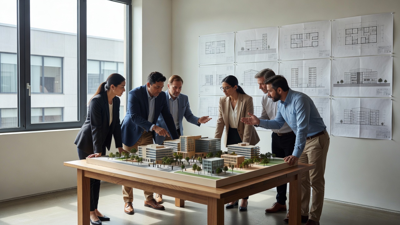
Separate visual confidence from technical proof
Soft daylight does not prove useful daylight availability. Green planting does not prove biodiversity gain. Clear glazing does not prove thermal comfort. Where the presentation makes a performance claim, identify the analysis, assumptions and qualified reviewer behind it. Standards such as EN 17037 address daylight assessment; a rendered impression is not a substitute for the applicable assessment method.
Likewise, an image cannot establish compliance with access guidance such as BS 8300. Its role may be to explain a route already checked elsewhere. Keep the technical statement and the illustrative statement adjacent, but distinguish them. A caption should not ask the viewer to infer validation from visual polish.
Write revisions that can be closed
“Make it feel more realistic” is difficult to act on and impossible to verify consistently. “Restore the approved entrance width and retain the handrail in the baseline model” is specific. Give each note a category, location, owner and acceptance condition. Separate an image correction from a request to change the architecture.
- Evidence check: Does the image match the agreed model, camera and site baseline?
- Interpretation check: Are light, occupation and materials plausible without implying unsupported certainty?
- Audience check: Could a reasonable viewer mistake an option for an approved commitment?
- Closure check: Can a reviewer tell whether each requested revision has been resolved?
Preserve disagreements when they remain material. A short issue note is better than an artificial consensus created by removing inconvenient detail. The strongest review culture allows someone to say that the image is excellent but unsuitable for this use. That distinction protects both the designer’s argument and the visualizer’s craft.